Saturday, December 21, 2013


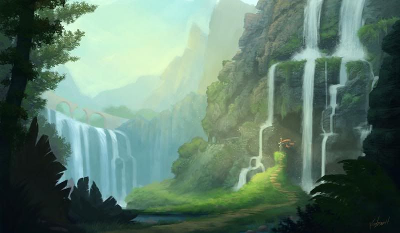
Final project for one of my classes. Its a scene from a video game I played as a kid: Secret of Mana. Here's the process of how I painted it-

Started with a speed painting to lay down basic composition and colors. The scene in the game is where the protagonist falls off a bridge, down a waterfall, and lands in a valley where he finds a sword stuck in the ground. You can see the bridge in the background on the left.


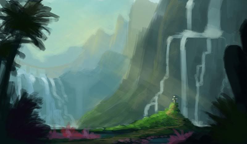
Changed some of the shapes to be more interesting and added more greens to the closest cliffside. Also gave the sword a red cloth tied to it to make it more noticeable


Stared fleshing out some of the plant shapes in the foreground and added definition and texture to the waterfalls and nearby cliff.


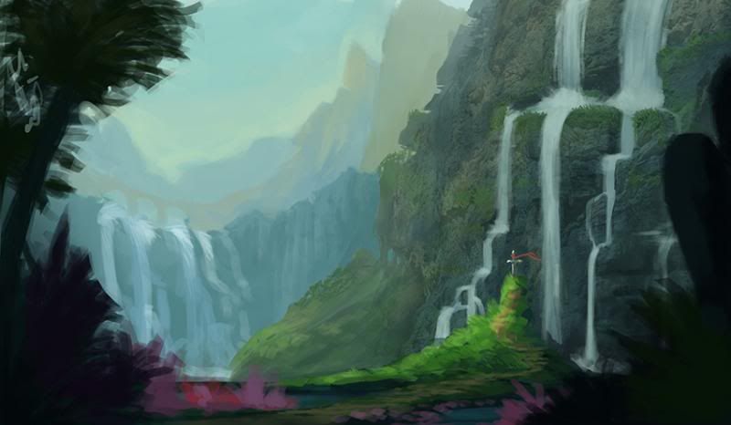
Added detail to the background and refined some of the plants in the foreground; cleaned up the waterfalls farther away and broke the bridge in the middle to tie in with the story. Also added some slight yellows to the nearby cliffside to show the direction of sunlight better and add visual interest through variety.


Really started defining the cliffside, spacing out the waterfalls even more around the sword to seem less crammed in the space. You can also see how the waterfalls draw the eye down and lead them to the sword by the angles they are at. Started sharpening up more of the foreground plants and objects as well as the middle ground. You'll notice the sword is a bit more refined too. I kept the strong sunlight coming in from the left on a separate layer and put it on top of everything to make sure it still worked. It also acts as a compositional element to draw the eye toward the sword as the center of attention.


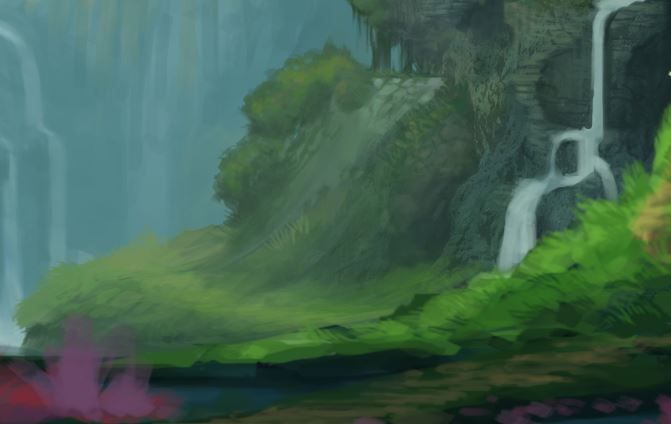
You can also see in this closeup the attention I'm giving to add visual interest to parts that aren't even that important. This is something I learned from Sam Nielson's class this year - to maintain the basic value in an area, but still maintain interest through slight shifts in color and texture. Even though that rock is not a focal point, it adds to the overall appeal of the piece.


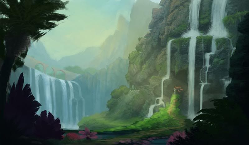
Made some major changes to the foreground plants. I was frustrated with the palm tree for several reasons - it was pissing me with its perspective and trying to get the fronds to look right and it wasn't fitting in the space I wanted without messing with the composition (which was more important). I scrapped it in favor of some more appropriate trees that probably make more sense being near a waterfall anyway. I also ditched the purple and pink colors of the foreground plants; I originally liked having those colors because I thought they would add to the fantasy of the landscape, but I realize they just take away from the color harmony and distract from the real focus. I also started refining the middle ground and the grass around the sword.


Finally, I polished off the middle ground and sculpted it to reflect the strong sunlight. I added in little sun-dust sparklies around the sword as well, more as a gimmicky cool-looking element than anything. Then I bumped up the contrast just a tinsy bit to give more of a bright sunshiny feel to it, and slapped my signature down in the corner.


Saturday, December 14, 2013

Tuesday, December 3, 2013

Christmas in L.A.

So about a month ago, I got the awesome opportunity to work on the music video for The Killers' new Christmas single "Christmas in L.A." Mostly doing character design and a little rotoscoping alongside the students in BYU Animation.

Today, the video came out on youtube


Before I say anything else - This video was made to promote the Killers' song. ALL of the proceeds from that song (literally 100% of the money) goes to R.E.D.'s AIDS relief. The video was shot on a miniscule budget, the artists worked for free, and the celebrity aspects of it were all done for charity. That being said, please consider buying this song.

Now you're probably wondering - hey Kendall, what parts did you do? Here is some of the work I put into it:

Early on, I got an email from the director Kelly Loosli asking for some designs of Owen Wilson in the style of Robert Valley - all of the animation was going to attempt to imitate him


Although my designs for Owen didn't get used, I started off doing mostly character designs for the video. Brandon Flowers acquired the rights to use Warren Zevon's image in the video and asked us to include him in it, so while other artists worked on background characters, I designed Zevon. 


These were my first two passes at Warren, each one getting warped a bit to try and play around with Valley's style. We ended up going with the top one and you can see the full-body version of it in the music video (at 3:46 Owen Wilson is in an audition line and to the far right is Zevon). 
I did a few more shots of Zevon - one of him that was used in the church scene (at 2:34 you can see him blurred on a pew behind Owen) - and one that was supposed to be animated of him playing guitar on the street but due to time restrictions did not appear in the video.


They had me do two versions of Zevon on the guitar - one in Valley's style and one more realistic. While the animation was meant to be heavily stylized, Flowers wanted Zevon to look more life-like. 

A few more characters I was asked to fix design problems on were the woman with the sunglasses (at 2:54)


the family in the Christmas photo (at 3:09)


and the drunk guy in the Santa hat (at 4:00)


Obviously for the video they cut out alot of the details I drew to make things easier to animate.

I also took on designing the Killers as background characters in the video. The images were never used, but it was alot of fun and they look really good. Brandon Flowers is even wearing his favorite jacket.


One other thing I contributed was to the video's rotoscoping (tracing animation over live footage). At about 2:16 Owen is double-taking in his car when he sees himself walking around the city. I did the initial rough rotoscoping of the close-ups of his face in that sequence. Some of the work I did was used, cleaned up, and colored, but alot of it was thrown away or replaced. In the end, I learned that I hate animating and am content to stick to concept design.

Monday, November 25, 2013

Cathedral - now with gray


I took one of my drawings from a while ago and started painting it up. Still a WIP - we'll see if I ever completely take it to finish. Looks better when you get it at full size.

Tuesday, November 19, 2013

Dear Discover


You might be wondering what this is.

My good friend Rachel was sitting at her desk scribbling away at some doodles. She had received junkmail from credit card companies that included postage-paid envelopes that were meant for new customer applications. She was using the envelopes to send the doodles with this logic -

I don't need the credit card, and the postage is already paid for. Why waste it? At least the guys in the mail room will have something fun to do.

Then she let me do one. I hope those mail room workers appreciate my art.

Monday, November 11, 2013

The last of the inktobers


I actually did this during October - I've just been involved in a secret project that's prevented me from putting anything online for the last two weeks.

Monday, October 14, 2013

Desperobo pg 2!


Page 2 of my short comic about a robot cowboy! (see page 1 here) Still unfinished and uncolored - let me know what you think

Thursday, October 10, 2013

Monday, October 7, 2013

Desperobo!

Uncolored, unfinished, here is the mid-draft stage for page 1 of my short story: Desperobo


There are 3 pages total and the plan is to eventually color it and get it printed in an anthology project called Reality Not Included, in which I've already submitted another piece (currently unreleased)

Sunday, October 6, 2013

Inktober on hold


I've momentarily stopped Inktober to catch up on all of my assignments at school. This is a small teaser of a 3-page comic I'm doing called "Desperobo"

Those bottles were annoying.

Thursday, October 3, 2013

Inktober, day 3

 Quorra from Tron!
First time doing a portrait in inks like this too

Tuesday, October 1, 2013

Inktober 2013!


First day of Inktober 2013! Part of Jake Parker's Inktober Challenge, I'm going to do my best to have an update every day this month of art done in inks.
No, not all of them will be pokemon.

Tuesday, September 17, 2013

Scarecrow Head Sculpt


Making a really creepy scarecrow character for a class. And yeah, school's here again, so that means posts are gonna be erratic *sad face*

Thursday, August 29, 2013

Tom Hiddleston


Just something I did for fun. The text is from a movie called Hottie Boombalottie. If you like watching movies about awkward geeks that talk to cardboard cutouts, you'll enjoy it.

Wednesday, August 28, 2013

Scyther-Marowak fusion


Its been a while, so I thought I'd do another fusion. They seem to be getting creepier and creepier... maybe I ought to ease up.