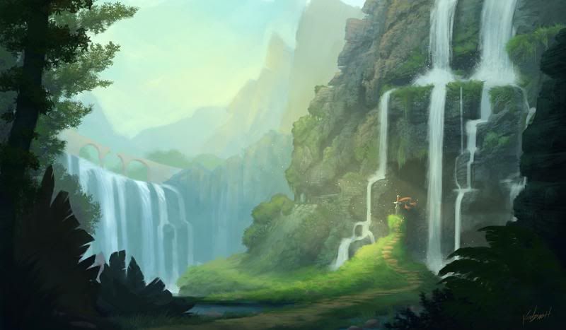
Final project for one of my classes. Its a scene from a video game I played as a kid: Secret of Mana. Here's the process of how I painted it-
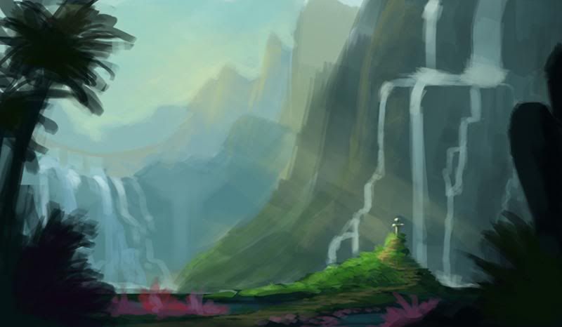
Started with a speed painting to lay down basic composition and colors. The scene in the game is where the protagonist falls off a bridge, down a waterfall, and lands in a valley where he finds a sword stuck in the ground. You can see the bridge in the background on the left.
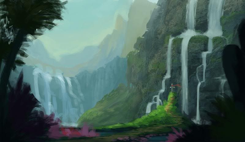
Changed some of the shapes to be more interesting and added more greens to the closest cliffside. Also gave the sword a red cloth tied to it to make it more noticeable
Stared fleshing out some of the plant shapes in the foreground and added definition and texture to the waterfalls and nearby cliff.
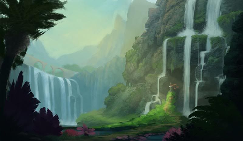
Added detail to the background and refined some of the plants in the foreground; cleaned up the waterfalls farther away and broke the bridge in the middle to tie in with the story. Also added some slight yellows to the nearby cliffside to show the direction of sunlight better and add visual interest through variety.
Really started defining the cliffside, spacing out the waterfalls even more around the sword to seem less crammed in the space. You can also see how the waterfalls draw the eye down and lead them to the sword by the angles they are at. Started sharpening up more of the foreground plants and objects as well as the middle ground. You'll notice the sword is a bit more refined too. I kept the strong sunlight coming in from the left on a separate layer and put it on top of everything to make sure it still worked. It also acts as a compositional element to draw the eye toward the sword as the center of attention.
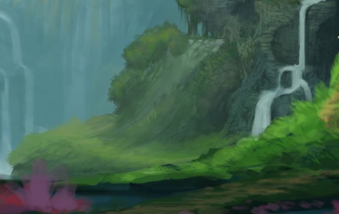
You can also see in this closeup the attention I'm giving to add visual interest to parts that aren't even that important. This is something I learned from Sam Nielson's class this year - to maintain the basic value in an area, but still maintain interest through slight shifts in color and texture. Even though that rock is not a focal point, it adds to the overall appeal of the piece.
Made some major changes to the foreground plants. I was frustrated with the palm tree for several reasons - it was pissing me with its perspective and trying to get the fronds to look right and it wasn't fitting in the space I wanted without messing with the composition (which was more important). I scrapped it in favor of some more appropriate trees that probably make more sense being near a waterfall anyway. I also ditched the purple and pink colors of the foreground plants; I originally liked having those colors because I thought they would add to the fantasy of the landscape, but I realize they just take away from the color harmony and distract from the real focus. I also started refining the middle ground and the grass around the sword.
Finally, I polished off the middle ground and sculpted it to reflect the strong sunlight. I added in little sun-dust sparklies around the sword as well, more as a gimmicky cool-looking element than anything. Then I bumped up the contrast just a tinsy bit to give more of a bright sunshiny feel to it, and slapped my signature down in the corner.



Oh, wow!
ReplyDeleteLove it. Super cool work. Fabulous lighting and color!
ReplyDeleteKendal, this turned out gorgeous!! Good job :)
ReplyDelete